Color, brightness and intensity in home decoration
When we talk about color in decoration, we always refer to a combination. Even in the event that we choose the main color of the room, this is done in combination with the rest of the elements in the space (e.g. the type of floor, the color of the built-in furniture, the size of the room, how bright it is and of course its use room).
“A combination of contrasting colors stimulates the eye and emphasizes the individual features of a room, while a harmonious combination will unite them against the background”
Harmonious color combinations are suitable for areas where we spend more time, relaxation areas such as the living room, the bedroom, etc.
Opposite combinations are more appropriate in areas such as the hall, the head of the stairs, the kitchen and the bathroom.
In both cases we avoid extremes, too much contrast is tiring , while too much harmony becomes monotonous .
In a traditional bedroom with rich architectural detail and a beautiful dark wood floor, some decorators keep the setting neutral by using a soft yellow color in the fabrics. In this way, the wall and the floor are harmoniously combined, without competing with the other colors.
The goal in contrast and harmony is ideal balance. For example, we choose a main color from the basic color palette and experiment with contrasting elements in accessories to liven up the space.
The more vivid the main color we choose, the more careful and measured we must be in its use. Do not forget, however, that the intensity of the color decreases with each mixing.
If you are one of those who are attracted to a yellow wall, but are worried about creating too much tension in the space and are looking for a guide to the shades, then the following example is indicative. Using colors such as grey, blue or even black combined with layers of white in the rest of the room’s accessories can help achieve an elegant and classy look.
How can I reduce the color intensity in the room?
The best known way to “lower” the intensity is by adding neutral tones, whites, blacks and various shades of gray which are the result of mixing white and black in various proportions.
The neutral tone of white can be best used in spaces with a strong color (or pattern).
Gray shades of secondary and tertiary colors are ideal for softening the intensity of color combinations.
Black adds spectacularity but for this reason we must be very sparing in its use to avoid exaggeration.
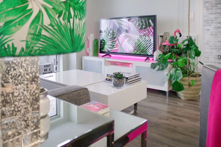
In theory mixing different patterns should not normally give a satisfactory result. However, in the event that we want to create a specific style, such as for example the configuration of a more bohemian interior, the appropriate combination of colors with the same brightness ties the whole together harmoniously.
Here we must understand that the brightness of a color depends on its black content , while the tone of a color is the property that expresses its relationship with light (e.g., how intense or dark it is when exposed to light under different perspectives). Light tones increase the volume, while dark ones decrease it.
What is the ideal brightness?
We must make it clear that successful color combinations depend both on their tonal relationship and on the shades we choose to combine.
The topic of color intensity and brightness is huge and requires a lot of resolution, so in this case, to avoid the resolution, we will simply suggest that you start the selection process by using two colors of your choice with the same brightness tone, reserving colors that have emphatically darker or brighter tones for accessories.
Another easier way to play with brightness is by using special color effects. Using these colors creates a more atmospheric feel and can enhance the features of the room. It’s a good idea to experiment with different color combinations on plain pieces of wallpaper paper first.
Are there any other tricks with color?
One of the most well-known tricks that can deceive the eye is by using a pattern. Choosing wallpaper with a strong vertical element in its design (e.g. stripes) makes the wall appear taller.
Also, covering one end wall of a long hallway with boldly patterned wallpaper will bring it closer and draw the eye away from the long side walls.
In the event that we have a sloping ceiling and we do not know what the boundaries of the wall are, a smart solution is to paint the entire room in a single color and use a frieze to create a virtual ceiling line.
Finally, a well-known trick especially in high-ceilinged rooms, is to use a darker color on the ceiling than the one used on the walls of the room to make it appear lower than it really is. In addition, let’s remember that lighter colors are preferred in vaulted ceiling sections.
We would advise initially, to put the color swatch cards aside for a while and experiment with your own mixing, starting from a limited palette and see how many shades you can achieve.
To reiterate, dark reds, greens and blues absorb light and make the room appear smaller, while whites, creams, yellows and light reds reflect light and make the small room appear more spacious.

